The Role of Color Theory in Comics: Setting Moods, Differentiating Characters, and Making Scenes Pop
Comics are a vibrant medium where visuals and narratives intertwine to create compelling stories. While the intricate lines of illustrations grab immediate attention, it’s often the colors that breathe life into the pages. Color theory, the art and science of using colors to evoke emotions and convey ideas, plays a monumental role in the world of comics. Let’s delve into the importance of color theory in comics and how it influences storytelling.

1. Setting the Mood of the Story:
Every hue carries with it a cascade of emotions. Think about the difference in feeling between a scene awash in cool, muted blues and one drenched in fiery, intense reds.
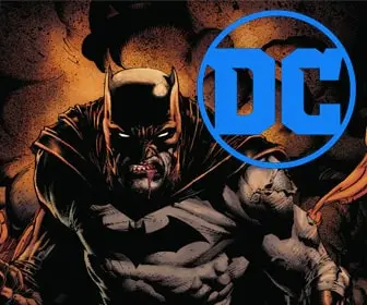
- Cool Tones (Blues, Greens, Purples): Often used in mysterious or introspective scenes. They can convey calm, sadness, or introspection. Think of Batman’s brooding moments in Gotham, with the city’s skyline often draped in shades of blue and purple.
- Warm Tones (Reds, Oranges, Yellows): These colors might be used in action-packed sequences or moments of intense emotion. The final face-off between a hero and a villain might be enveloped in a palette of blazing oranges and reds to amplify the tension.
2. Differentiating Characters:
Color can become an integral part of a character’s identity. Just as Superman is instantly recognized by his red cape, many characters are closely associated with specific color palettes.
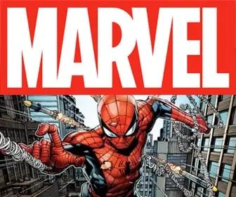
- Iconic Palettes: Certain characters are synonymous with their color schemes. Wolverine’s yellow and blue suit, Spider-Man’s red and blue attire, or the Joker’s purple and green ensemble are inseparable from their personas.
- Character Temperament: Sometimes, colors are used to give hints about a character‘s nature or evolution. A character dressed in softer shades might be portrayed as gentle or virtuous, while one in stark black could signify a more complex or darker nature.
3. Making Scenes Pop:
Dynamic color contrasts can make particular scenes or elements stand out, guiding the reader’s attention to crucial parts of the story.
- Spotlighting: Using a distinct color to highlight a specific character or object in a panel can direct the reader’s focus.
- Flashbacks and Time Shifts: Shifting color palettes can signal a change in time or perspective. Flashbacks might be rendered in sepia tones or grayscale to differentiate them from the story’s present timeline.
- Emphasizing Emotions: An emotionally charged moment, like a character’s realization or a plot twist, can be accentuated using stark or contrasting colors. This helps in driving the emotional impact of that moment.
The Subtlety of Shades:
It’s not just about picking a color but choosing the right shade. A dark, navy blue has a vastly different impact than a soft, sky blue, even though they’re both blues. The depth and richness of colors can add layers to the narrative, making scenes more nuanced and impactful.
Final Thoughts
Colors in comics are not mere backdrops; they’re active storytelling tools. The next time you pick up a comic book, take a moment to appreciate the symphony of colors and how they guide your emotions, enhance the narrative, and make characters memorable. For comic creators, understanding color theory isn’t just an advantage—it’s essential. Investing time in mastering this can truly make your stories come alive in hues and shades.


